[framed_box width=”550px” bgColor=”transparent” rounded=”true” align=”center”]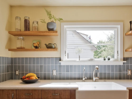 Photo by Howells Architecture + Design, LLC[/framed_box]
You’ve chosen a rectangular tile. Have you decided which direction you want it laid out?
Some tiles lend themselves to particular layouts, but others open up many options. Rectangular tiles are common and have several possible layouts; a traditional layout uses an offset horizontal orientation. But consider for a minute whether a vertical layout might work better for your particular room.
[framed_box width=”550px” bgColor=”transparent” rounded=”true” align=”center”]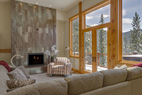 Photo by M Squared Construction[/framed_box]
Laying your tile in a vertical direction adds a subtle design touch. It can show that the choices made in your design were intentional and thought out without feeling contrived. You didn’t just go with the first, most basic choice – sometimes that’s the right choice, and sometimes you need to go beyond the obvious.
[framed_box width=”550px” bgColor=”transparent” rounded=”true” align=”center”]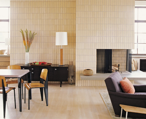 Photo by ABRAMS[/framed_box]
Vertical layouts can add visual height. Use them in an under-cabinet backsplash, which can often benefit from the effect of extra height, or up a full wall. Having distinct vertical lines draws the eye up to add height and drama, similar to installing full-length drapes or wearing vertical stripes.
[framed_box width=”550px” bgColor=”transparent” rounded=”true” align=”center”]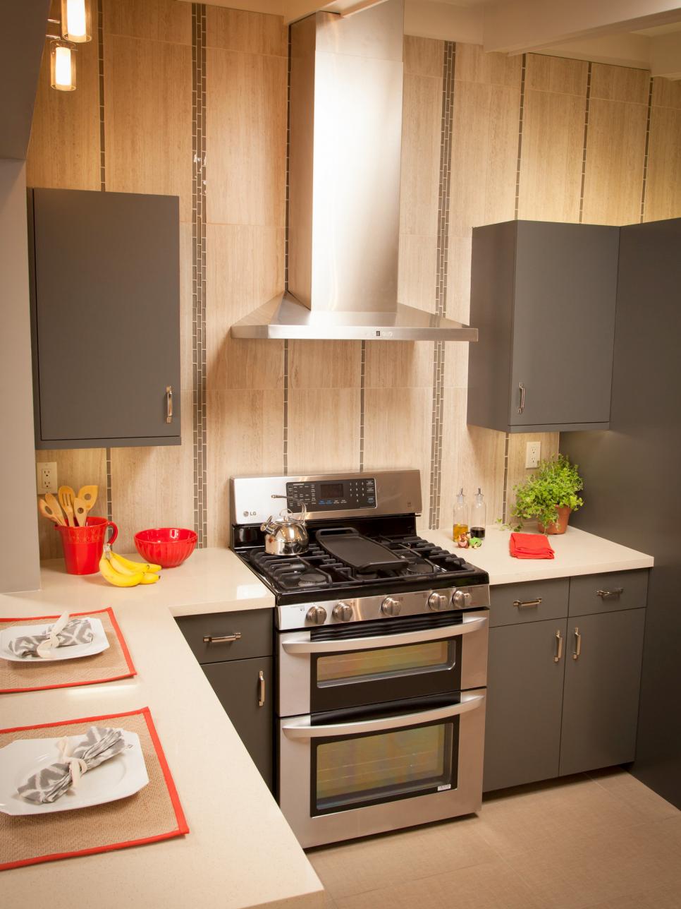 Image via HGTV[/framed_box]
Consider using the same tile vertically in your shower and horizontally along the wall behind the sink. Or create a right angle to create an interesting, unique flow from one area of the room to another as shown below (this is one of my favorite ways to upgrade basic subway tile.) Using the same tile throughout a space but changing the layout allows you to subtly differentiate each area.
[framed_box width=”300px” bgColor=”transparent” rounded=”true” align=”center”]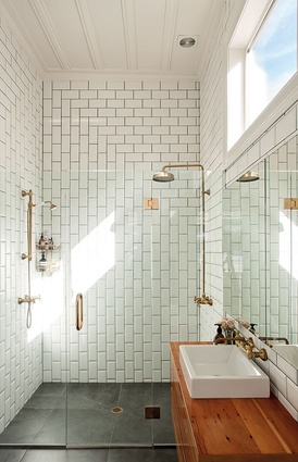
Image via ArchitectureNow[/framed_box]
Not all vertical layouts are the same. Some work better in a contemporary space, while others are more traditional – but not dated. A few options are shown below.
[framed_box width=”450px” bgColor=”transparent” rounded=”true” align=”center”]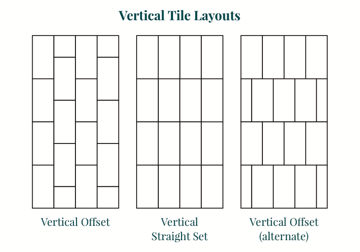
[/framed_box]
The basic differences come down to where you align or offset the tiles. Even with a vertically laid tile, sometimes the strongest visual lines are horizontal and vice versa. That can make a significant difference to the final appearance with a contrasting grout, so keep in mind how everything will work together.
[framed_box width=”550px” bgColor=”transparent” rounded=”true” align=”center”]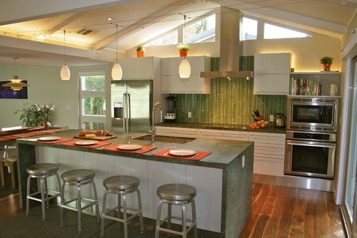
Photo by Tali Hardonag Architect[/framed_box]
Consider the pattern of the tile as well. A solid subway tile will read differently than a tile with a linear pattern. Non-rectangular tiles can have a distinct direction, too, and provide the same benefits in a vertical layout.
[framed_box width=”550px” bgColor=”transparent” rounded=”true” align=”center”]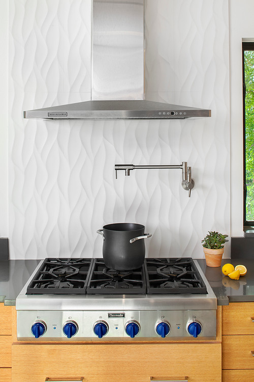 Photo by Laura Burton Interiors[/framed_box]
Another option for adding height and vertical emphasis is simply adding an accent band. We’ve been seeing a lot of showers that use an accent tile running in a band up a wall. Try a contrasting color, distinctive pattern, or eye-catching metallic shine. This same technique works in other areas and other rooms as well. The fireplace below has a strong vertical emphasis and showcases the height of the room.
[framed_box width=”550px” bgColor=”transparent” rounded=”true” align=”center”]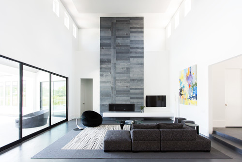 Photo by Duckworth Interiors[/framed_box]
A vertical layout can add a custom look, emphasize height, or be used to differentiate areas of a room. If this would solve any design dilemmas you have, have someone hold a few tiles up so you can envision how it would look. If you’ve used a vertical layout already, we’d love to see what you’ve done! We’ve put together collections of inspiring images on Houzz and Pinterest as well.
If you’re ready to update a room in your home, start your free design consult with us! Our designers can help you put together a great space that reflects you and truly feels like home.
[divider_line]
If you haven’t chosen your materials yet, try one of these!
[rev_slider alias=”vertical_tiles”]
